Understanding and using balance in photography is crucial. It helps you create visually appealing and harmonious photos. We explore this concept and provide insights into effectively enhancing compositions through balance.
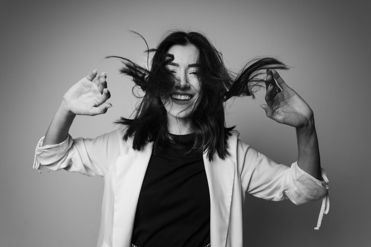
A balanced portrait shot with a Canon EOS R5. 26mm, f/9, 1/80 s, ISO 160. Jonathan Borba (Unsplash)
What Is Balance in Photography Composition?
Balance in photography can be compared to the equilibrium of weighing scales. The placement of objects determines whether the photo is balanced or unbalanced. A composition can be two things:
- Symmetrical: A pleasing, harmonious, balanced composition
- Asymmetrical: An uncomfortable or unresolved, unbalanced composition
Symmetrical balance is easily recognizable. First, divide a photo in half with a fulcrum in the middle. You can see identical objects placed in the same way in a scene to make a balanced image. Most people like this symmetry.
But obvious balance in photography can be somewhat boring. Asymmetrical imbalance adds interest and avoids monotony. It is not balanced traditionally. You can create a more interesting composition by tipping the balance in one area more than the other.
We’ll discuss and show examples of balanced and unbalanced photos. Both have a place in your compositional tool kit.
Visual Elements and Placement for Balance in Photography
Size, visual weight, and placement of elements contribute to balanced compositions. Experiment with positioning smaller and larger objects. This ensures they are not equidistant from the center. And it creates a dynamic equilibrium akin to weights on a scale.
Anyalze Visual Weights
It’s important to explore the visual weights of primary subjects. Suppose you have a small and large object. In photography, it is impossible to balance them if they are equal distances from the center of the photo.
But you can try placing the smaller object on the far edge of the frame and the larger object a little off-center. The balance will be much better resolved, as it would be with actual weights on a scale.
The main subject then has an informal balance in the image, with the secondary subject equaling its weight through its placement. This principle can sometimes be used in the rule of thirds.
This is demonstrated in the example photo below. The off-center person on the far right balances the large door off-center to the left. The person’s shadow and converging horizontal and vertical lines provide stability and balance.
This shows that balance is not solely about equal distribution. It is also about visual harmony.
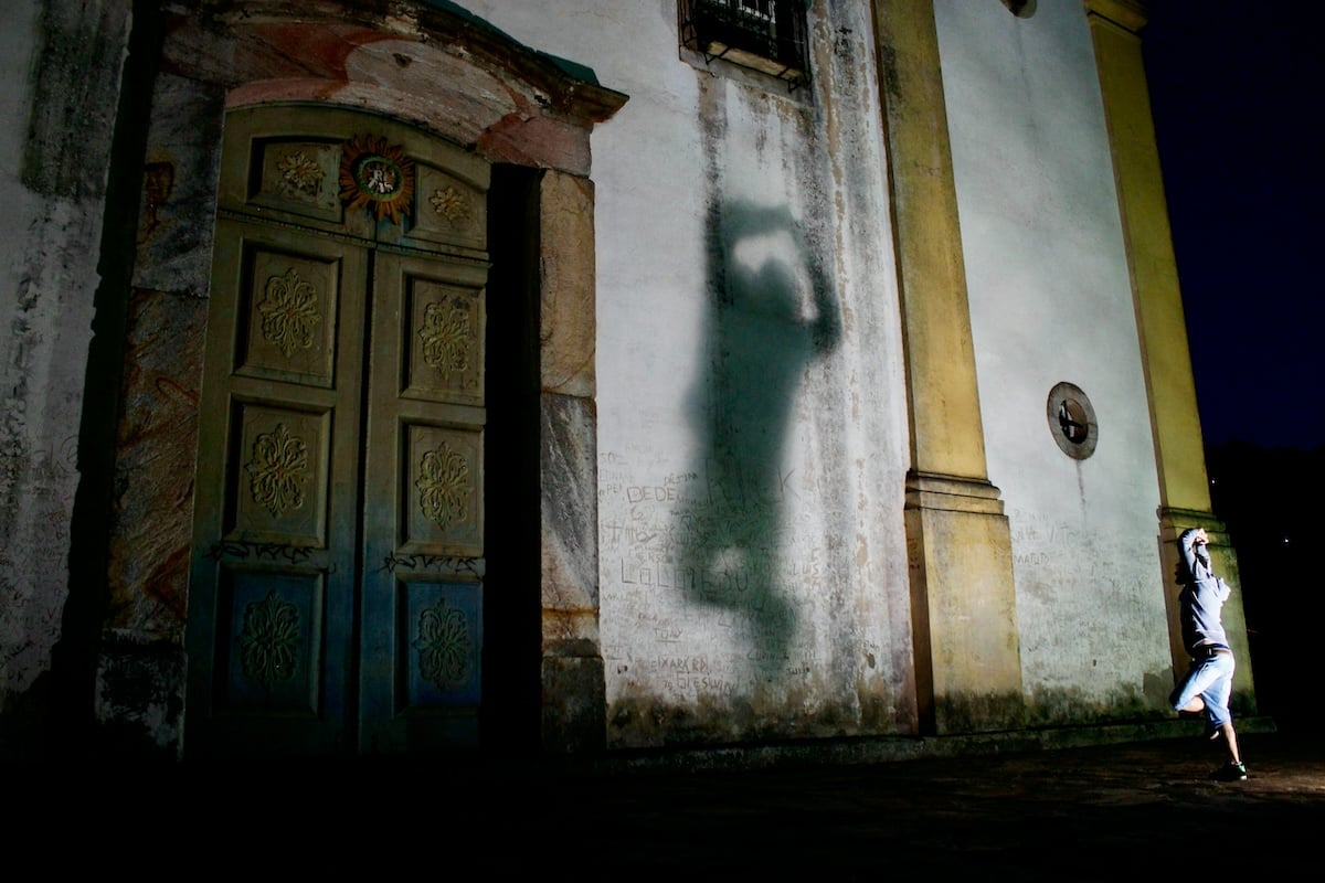
Shot with a Canon EOS Rebel T3i (300D or Kiss X5). 18mm, f/4.5, 1/40 s, ISO 1600. William Felipe Seccon (Unsplash)
In another example below, let’s look at the visual weights of the two primary subjects. It is not a typical balanced composition.
Look at the off-center subject on the left. The smaller skateboarder in the negative space at the right edge of the photo counterbalances him. There is a lot of lead room in the composition.
The photographer also used converging vertical and horizontal lines to draw attention to the main subject. Again, these lines provide a stable and balanced base.
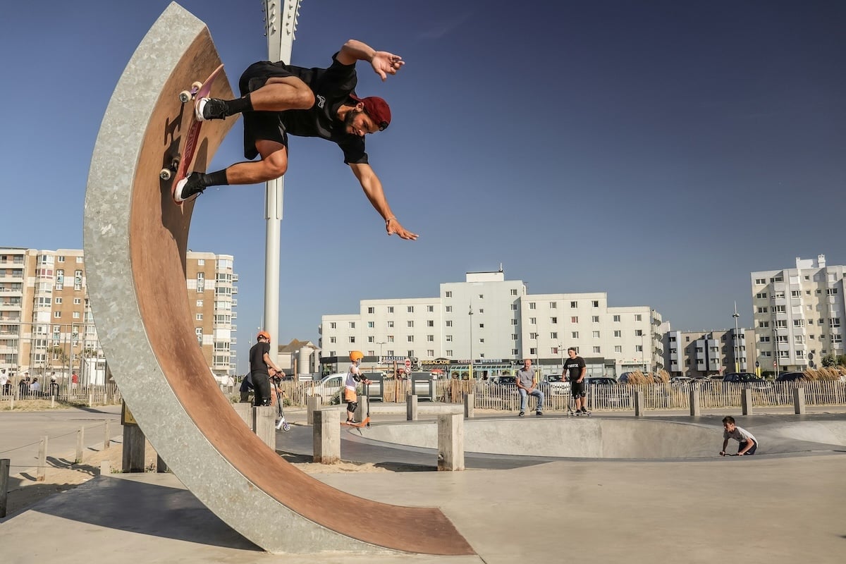
Shot with a Canon EOS Rebel SL3 (250D). 18mm, f/5, 1/800 s, ISO 100. Ruben Christen (Unsplash)
Disrupting Balance for Interest
Balance is important in photography, but disrupting balance can create more interesting images. Asymmetrical compositions help attract the viewer’s attention.
You can also use the unusual placement of a single object, dynamic tension, and single leading lines. These all help create unbalanced photography. They produce a feeling of unresolved tension.
Balance is much more complicated than arranging a couple of objects in a photo by visual weight. It’s uncommon to see two objects on a solid base. This usually occurs only in architecture, symmetry, and reflections, like the image below.
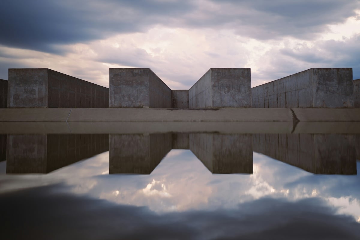
Shot with a Sony a7 III. 35mm, f/1.4, 1/500 s, ISO 100. William Priess (Unsplash)
The weighing scale analogy is good for explaining the basics. But for the majority of photographers, photography balance is much more complicated. And there are a lot fewer rules.
I would consider the image below asymmetrical. The main visual weight of the subjects is to the bottom left of the frame.
The vertical lines imply a solid base, and the horizontal lines create a zig-zag of natural tension. This acts as a weight for the right side of the photo. But it’s not enough to make it feel like a truly balanced photo.
Shot with a Panasonic DC-ZS200 (TZ200). 35.2mm, f/5.2, 1/800 s, ISO 125. Clio Di Giovanni (Unsplash)
Do You Want Balance in Photography?
Both balanced and unbalanced images are compositional techniques. The difference is that balanced images often have equal visual weight—they are mirror images.
But the viewer ultimately determines whether an image is balanced or unbalanced. The photographer decides how they want the viewer to perceive the photograph.
Deciding between a balanced and unbalanced photo is like deciding between tension and harmony. Each degree of choice has its different uses.
Sometimes, you want to add dynamic tension to your photos. You’ll find that the tension itself acts as a technique for unbalancing elements.
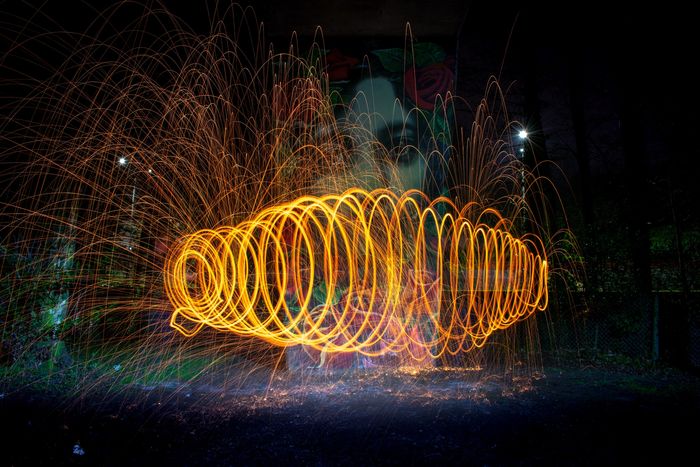
In the photo below, it’s hard to find the center of gravity. This is because the bridge’s lines go outwards in many contrasting directions. The small flare on the right and the artifact on the left are also distracting.
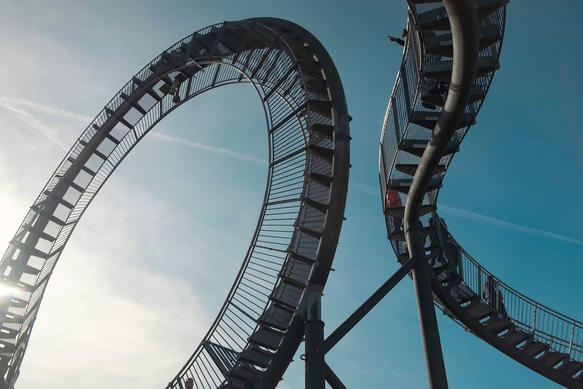
Shot with a Fujifilm X-T1 . 23mm, f/11, 1/250 s, ISO 120. Calvin Fitra Anggara (Unsplash) – rollercoaster
Unbalancing with Purpose
You can also unbalance a photo to direct the viewer’s attention to a specific part of it. It’s best to do this cautiously.
Don’t choose a position that’s too unusual for your subject. Otherwise, your asymmetrical technique will be obvious, and that’s much less effective.
In the photo below, you’ll notice that the balance is leaning toward the right-hand side of the photo. This leads your eyes to wonder what’s in the rest of the photo. Your attention moves towards the unfocused background person on the left.
This lack of balance makes the photo more interesting. And it makes the viewers look at it longer.
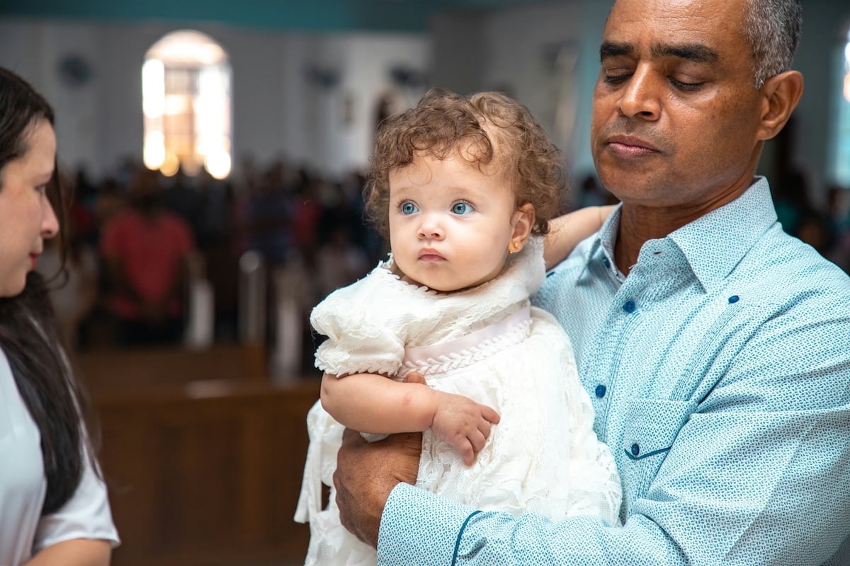
Shot with a Canon EOS 6D Mark II. 85mm, f/4, 1/125 s, ISO 500. Bryan Jesus De Los Santos Breton (Unsplash)
Unbalancing for Impact
Now, exaggerate the same effect using a shallow field and two subjects. You get results like the photo below. It’s hard to tell whether the books or the person in the background is the subject.
This unbalanced technique can change the subject. It goes from being the obvious focal point to what may seem insignificant. This sparks the viewer’s curiosity, making them want to look at something they think they’re not “supposed” to be looking at.
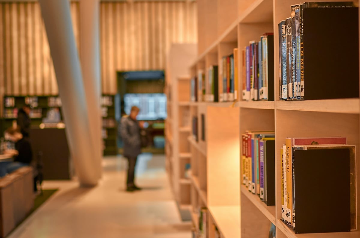
Shot with a Nikon D7000. 35mm, f/2.2, 1/80 s, ISO 400. Alexei Maridashvili (Unsplash)
Now consider your subject’s position in the frame by looking at height. It may bring up ideas of the two subjects having equal weight or not.
In the photo below, the fireworks seem to balance out the wide bridge’s weight. But the fireworks’ size and vertical position create a downforce on the left side of the image.
Different composition techniques have different effects. The better you understand them, the better your balance will be. The conceptual balance idea is one of the main techniques for adding interest.
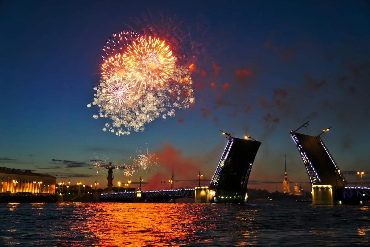
Shot with a Sony a6000. 28mm, f/4, 1/10 s, ISO 100. Alexander Kagan (Unsplash)
Conclusion: Striking the Right Balance in Photography
Achieving balance in photography is a nuanced art. As photographers, mastering balance and tension helps us take compelling images.
We can opt for symmetrical or asymmetrical compositions. But understanding the effects of balance on viewer perception is key to elevating our photography skills.
Remember, balance is at the heart of every photo. Its judicious application contributes to the overall impact of your work. The more aware you are of the effects of balance on your photos, the better your photography will be.
For another type of balance in photography, read our radial balance article. For more tips, check out our Intuitive Composition eBook to take stunning everyday images!